Posted on

Gerard Mas

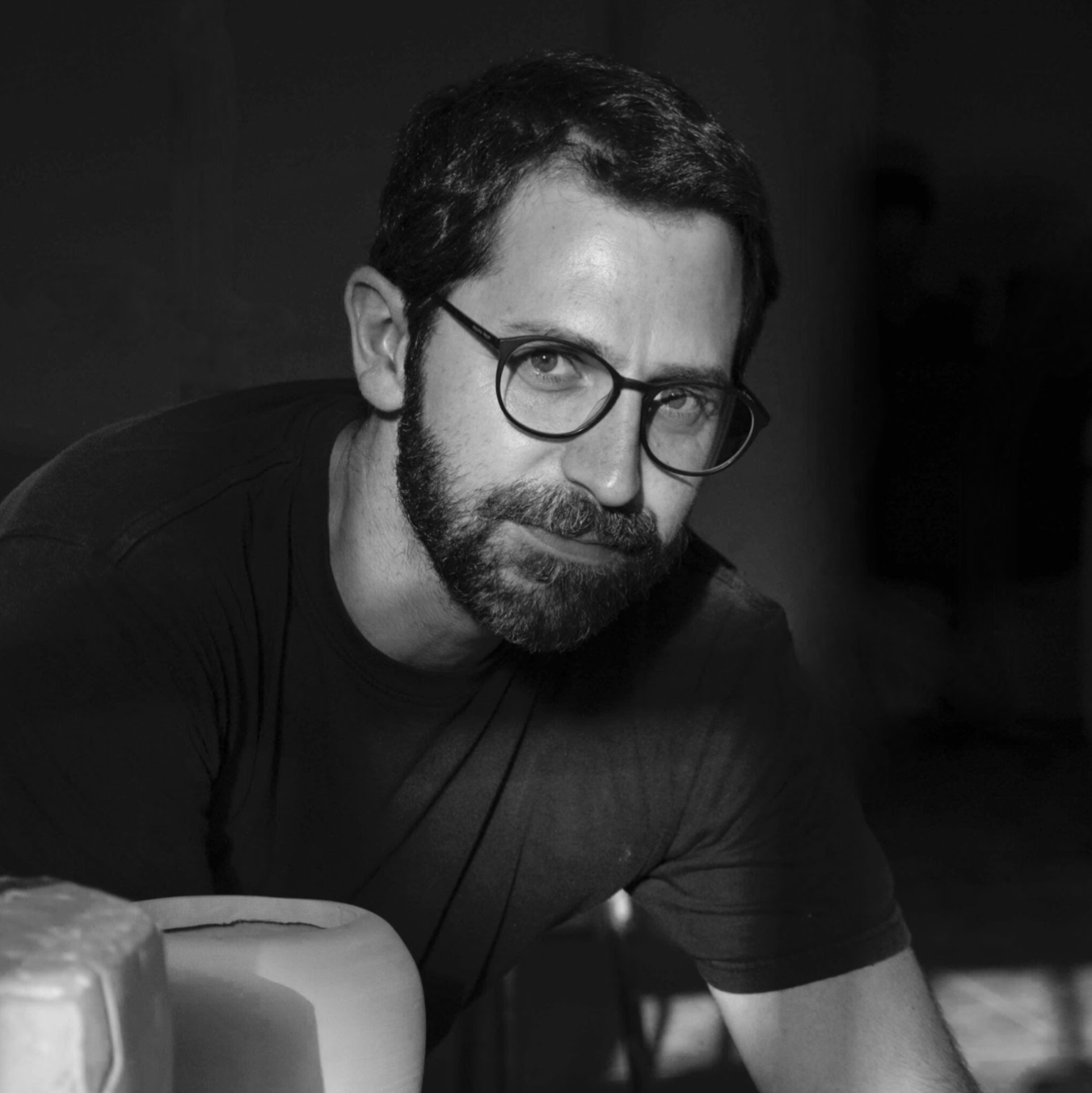
Gerard Mas was born in 1976 in Sant Feliu de Guíxols, Girona, Spain. He studied sculpture and stone carving at the Llotja Art School in Barcelona from 1998 to 2001. He later completed specialized training in sculpture restoration and conservation at the Escola Superior de Conservació i Restauració de Béns Culturals de Catalunya in Barcelona, graduating in 1998.

Mas’s artistic practice is deeply influenced by his early career as a restorer. His works, characterized by a realistic and figurative language, appear to align with academic traditions but are infused with irony and visual poetry. Depending on the needs of each piece, he employs a wide range of techniques, including stone carving, wood carving, colored resin, ceramics, and bronze. Through these materials, he frequently revisits events and themes from art history, reinterpreting them with a contemporary perspective. In his unique universe, imagined Renaissance noblewomen, fictional classical sculptures, and mythologized depictions of domestic animals coexist harmoniously.

Posted on

Baku Maeda

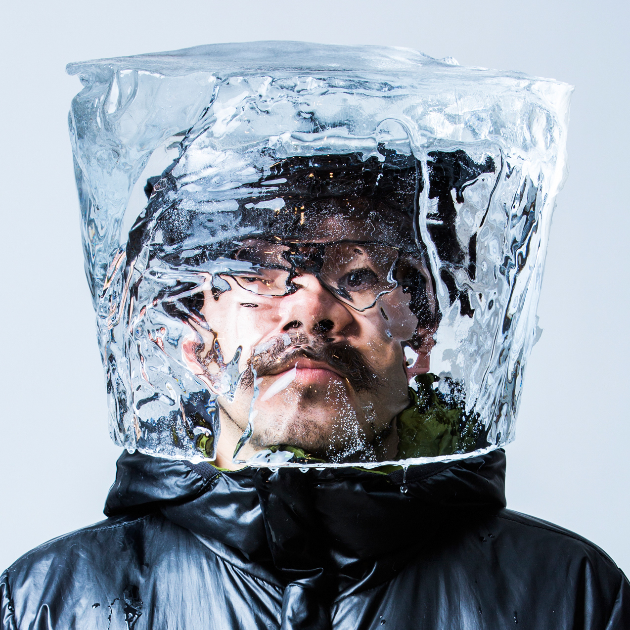
Born in 1974 in Sapporo, Baku Maeda graduated from the Economics Department of Hokkai-Gakuen University. In 2005, he became an independent freelance illustrator. In 2003, he joined the Japan-London 8-member illustration group “GOBACK2D.”

He incorporates broader, more conceptual thinking into his illustration work, whether in two-dimensional or three-dimensional forms. In recent years, he has focused on ribbon art through “Ribbonesia,” giving new life to inorganic paper figures through techniques such as bending and twisting.

Posted on

Yasuhito Kawasaki

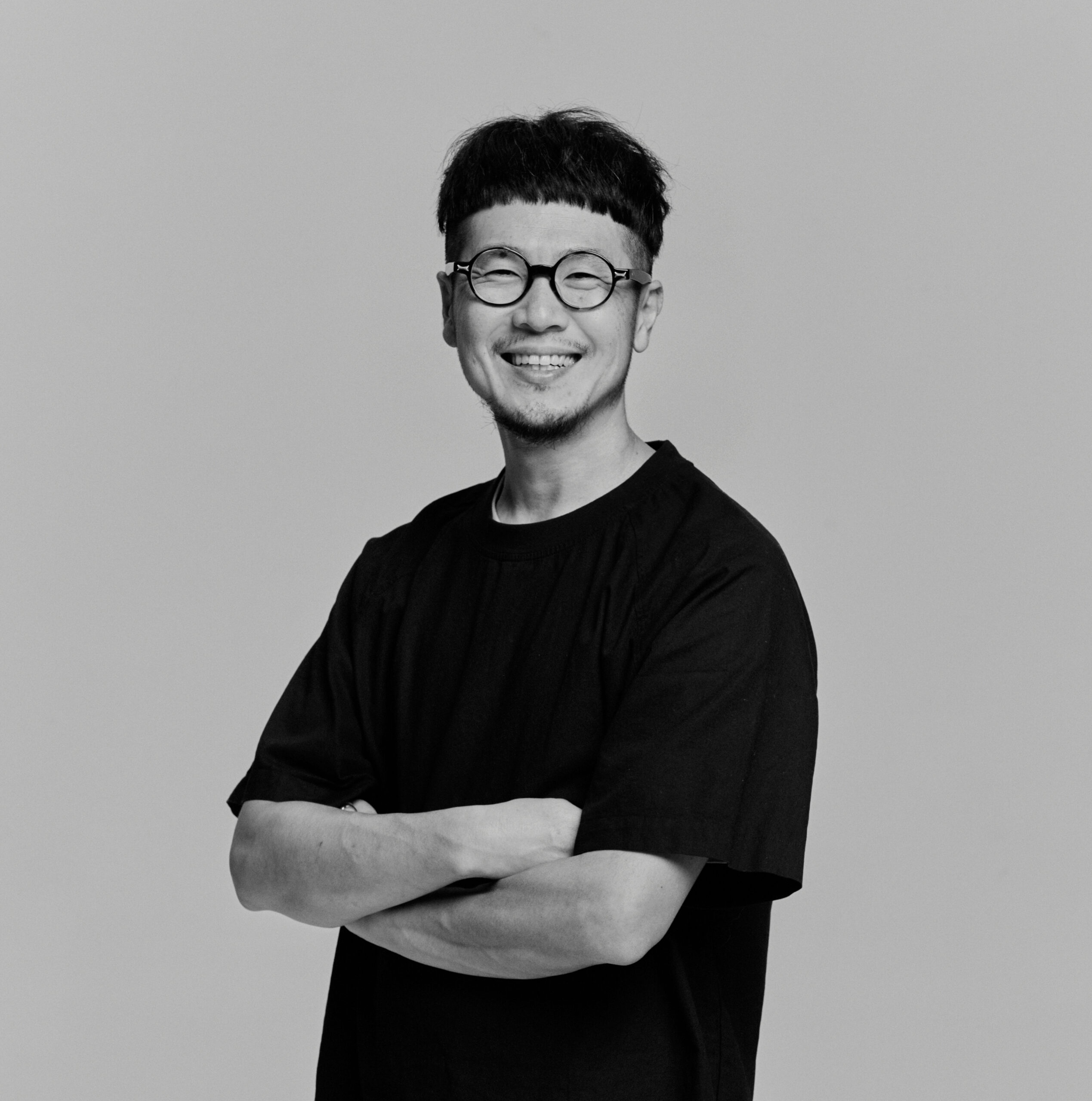
Kawasaki Yasushi believes that from birth, we interact with people who share similar characteristics with us, such as parents, siblings, or relatives. As a result, we develop a subconscious recognition of familiar faces, perceiving them as similar to our own. He notes that it is common for people to think that pets resemble their owners or that couples grow to look alike over time, seeing this as a natural psychological phenomenon.

In his artworks, Kawasaki often creates portraits that carry his own features. He sees this as a subconscious process rather than a deliberate attempt to imitate a specific subject, and thus refers to these works as “self-portraits.” Regardless of whether the subject appears male or female, he believes these works reflect his own projection and are not bound by gender.

After getting married, Kawasaki began to observe the subtle dynamics of a two-person relationship. These observations inspired his creations, exploring the processes of mutual acceptance and influence within the smallest social unit of a couple.

Posted on

Marina

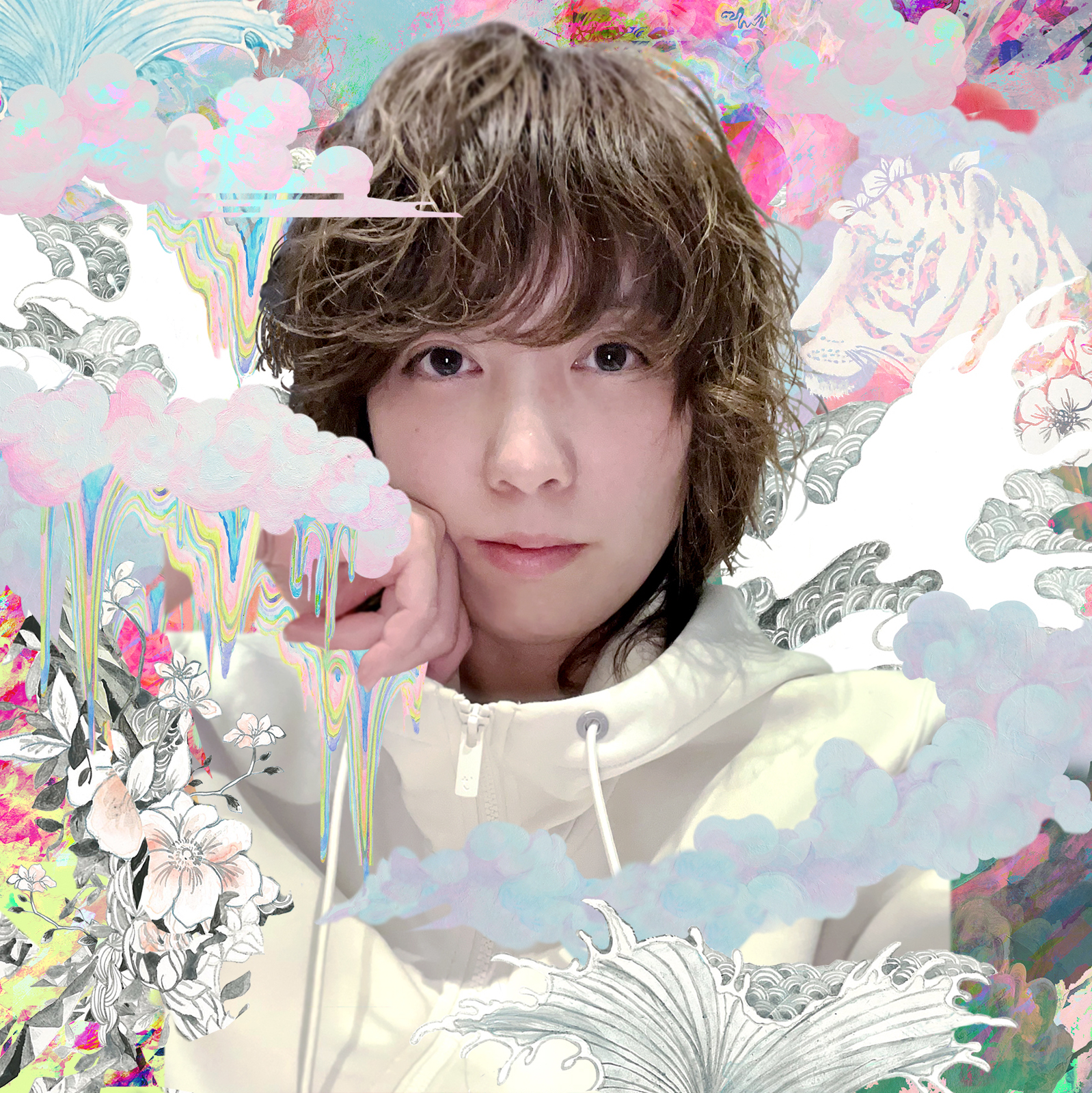
Marina, born in Hokkaido, Japan, focuses her artistic creations on women’s lifestyles, a theme she has named “Venus Eye.” This concept stems from her upbringing in a family centered around her mother and aunts and is deeply connected to her experiences as a mother. Additionally, her passion for the traditional festivals of Esashi in Hokkaido and her yearning for the sea have further inspired her work.

“Venus Eye” represents a divine perspective, akin to that of a goddess gazing down upon the world, capturing the beauty of both reality and fantasy. Her artworks uniquely portray women, illustrating their seamless transitions between the realms of fiction and reality, creating an aesthetic that is both authentic and transcendent.

Posted on

Dima Kashtalyan

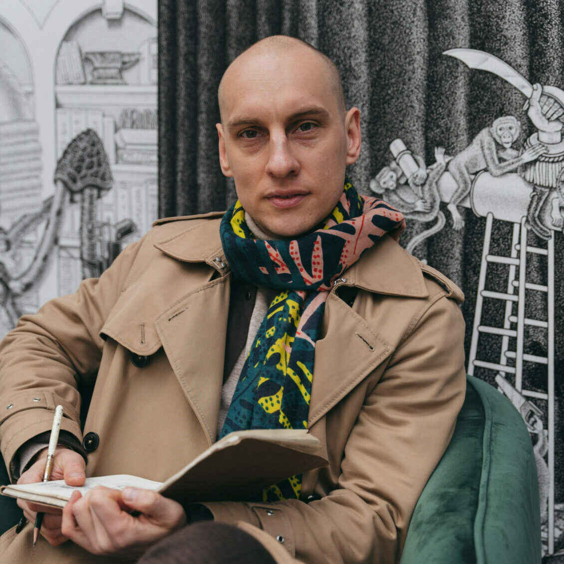
Currently living in Poland, the 35-year-old Belarusian artist Dima, whether through his illustrations or street art, consistently showcases a unique style that is both wild and refined. He categorizes his art as pointillism or stippling, a technique that uses hand-drawn dots as the smallest units of an artwork.

What Dima wants to say in his work is closely tied to issues of modern society and individual life. He cleverly picks familiar everyday objects as the main subject matters of his work to evoke symbolic qualities and resonances. For example, he might depict a fox with a city growing out of its head or a bird carrying a turtle shell on its back. This approach not only invites viewers to think about the meaning of the work, but also creates dramatic visual impact. 

Dimension wise, he prefers to work on large canvases. This allows him to meticulously refine every detail so that even up close, viewers can appreciate the precision and depth of his work. Dima’s work is not just visual pleasures but also intellectual feasts, with each piece whispering profound insights into the world.

Posted on

Giorgio Tentolini

Giorgio Tentolini was born in Casalmaggiore (Cremona) in 1978, he trained in Graphic Arts at the Toschi Art Institute in Parma, to graduate in design and communication at the University of Reggio Emilia. After stages with artists such as Marco Nereo Rotelli, he began a very personal research with installations on a photographic basis, for which he immediately obtained significant recognition. His paintings are influenced by his work as a photographer when he used to break down images in chiaroscuro levels.

Each of his works is born from a precise investigation of Time as memory and identity, in a careful and slow reconstruction that takes place with the study of light and the engraving of layers of different materials, fabrics, papers, PVC. Tulle and adhesive tape are the current medium of his search for the meditative lightness that its layers give back to the image, a metaphor for places and memories, dreams and visions. A pictorial work living the reality of sculpture.

Through the stratification of memories and experiences, the image resurfaces in this intangible substance, made possible only by losing oneself in a vision that does not follow the cognitive parameters of perception, raising doubts and questions about the true consistency of human being and the impossibility of fully grasping the essence of reality.


Posted on

Alejandro Monge

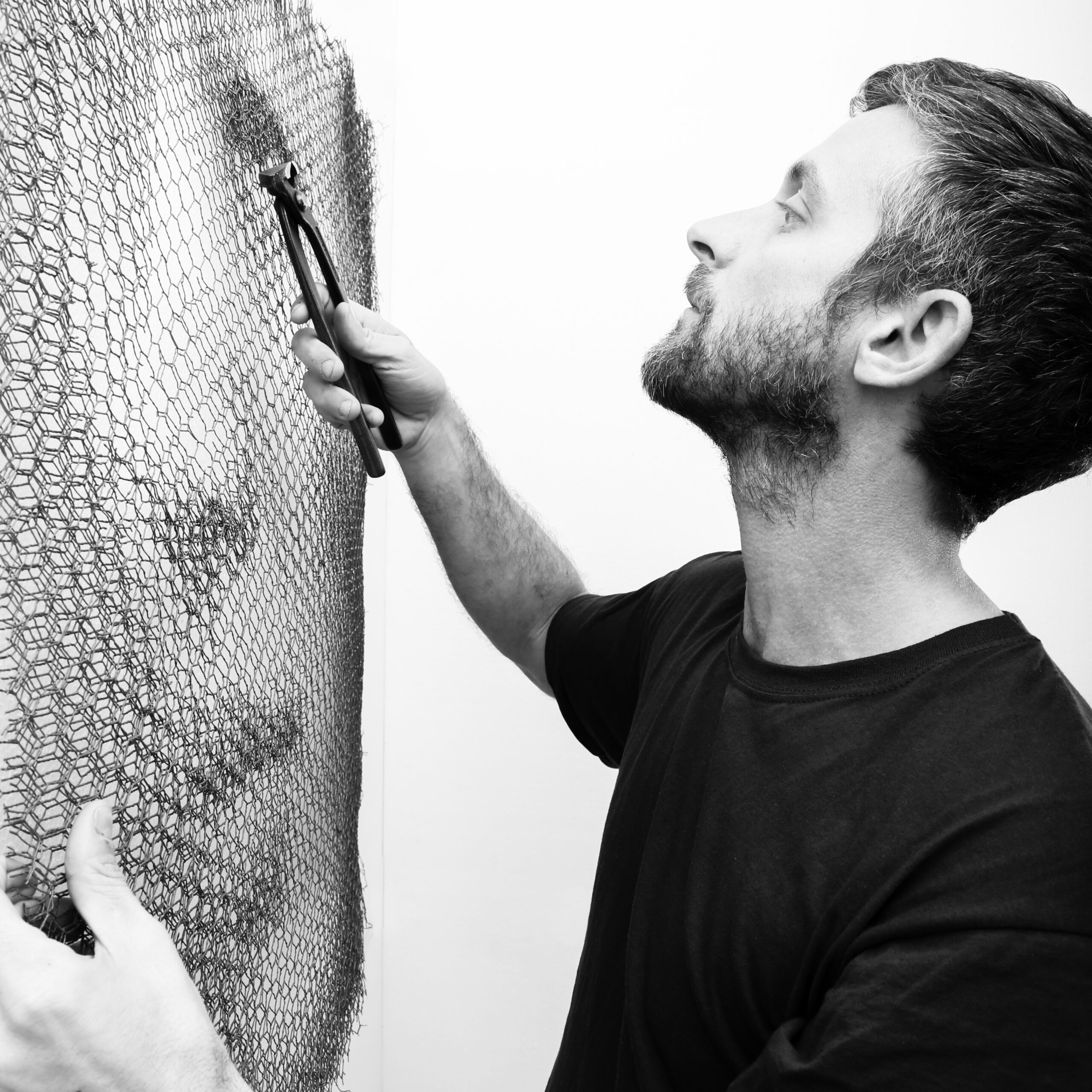
Born in 1988, studied Fine Arts, Sculpture and Visual Design at the Zaragoza Academy of Fine Arts. Currently focusing on sculpturing.

The portraits painted by Alejandro Monge transcend the visual depth of two-dimensional works. The volume and depth of his creations make them almost sculptural, striving to break through two-dimensional space. The chiaroscuro is reminiscent of Caravaggio; John Singer Sargent was his greatest influence.

Although Alejandro Monge specialized in sculpture during his visual arts training, the painted parts in his art are stunning in a hyperrealistic way that is reminiscent of photography and tries to trick the eyes of the observers. Afterward, he began to focus on the creation of sculptures and installations, one of which revolved around realistic banknote sculptures. Monge recreates them on paper and acrylic paint, stacking them in large piles, often in order to incinerate them. By destroying his own work, he satirizes his criticism of the omnipotent domination of today’s social and economic values, and this series has attracted extensive coverage and attention in the international media.

Alejandro Monge reflects on destruction as a new form of creation. While busts are invaded by contemporary classical elements, they still burn in the purest Baroque style or iconic objects reflecting contemporary events. With this, Monge presents an eclectic exhibition that combines different techniques and materials to generate an unusual aesthetic challenge. Each piece takes a long time to create, and he invests his body and soul, creating an emotional and psychological feedback between the artist and the piece.

Posted on

Oton

Oton is a self-taught artist, who has nurtured a passion for painting and drawing since childhood, particularly inspired by scenes from Madrid.

His work is full of mischievous and provocative elements. Beneath an aesthetic that appears childlike and innocent lies an acerbic reflection on our society. 

Artwork from his early stage of career featured a series of action paintings enriched with collage elements, exploring themes of neo-dadaism, abstract expressionism, and pop art.

Later on in his career, he took a pivotal move and began creating irreverent, scatological parodies of popular culture icons, questioning our relationship with media imagery. His playful, uninhibited drawings blend ingenuity with irreverence, reflecting a critical yet humorous perspective.


Posted on

Max Bi

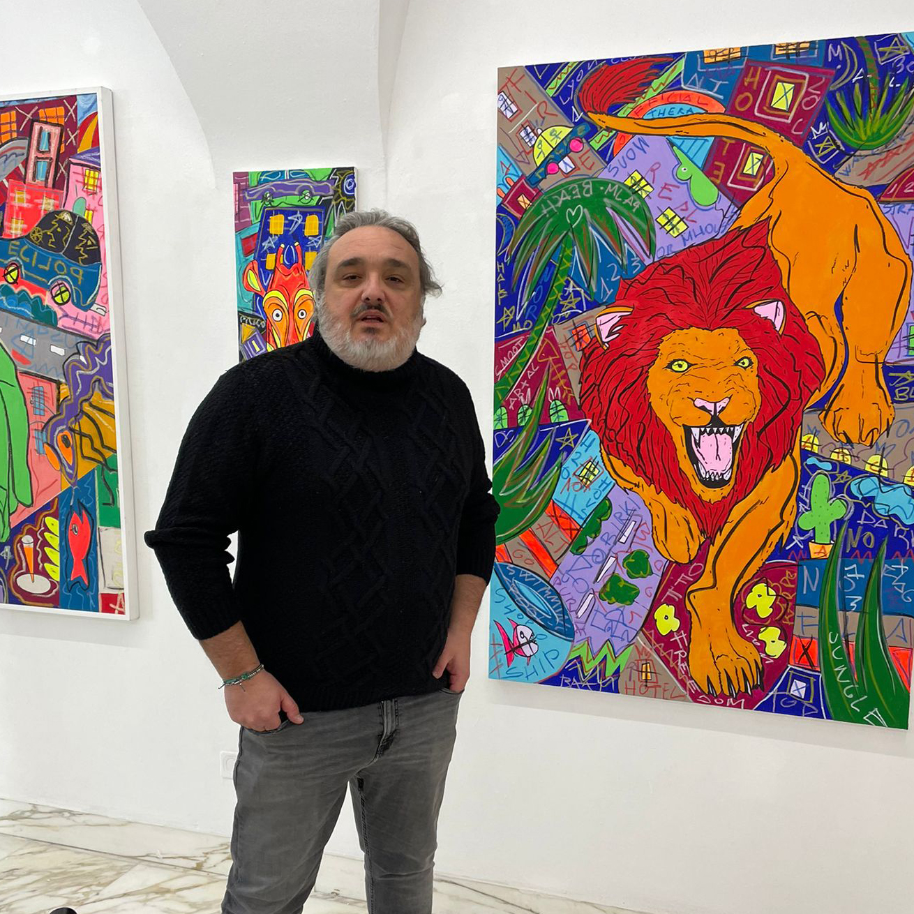
Max Bi’s inspiration comes mainly from the 1980s, a time of cultural upheaval with global capitalism, mass media, wealth disparity, and unique music typified by electro-pop and hip-hop. In addition, the 1980s were filled with politically pivotal events, such as the fall of the Berlin Wall in 1989, which marked the end of the Cold War. Max Bi was more influenced by important street and graffiti artists of the time such as Jean-Michel Basquiat, Keith Haring and Kenny Scharf.

In the early 2000s, Max Bi reproduced the writer’s calligraphic graphics on raw jute canvas using stencils and spray cans, their labels, which resembled the original glyphs, and took his figurative cues from Italian Pop Art iconography . Tribal masks from the Paladino or Basquiat-style graffiti, but reinterpreted in an informal way. A lot of fluorescent colors are used in Max’s works. This kind of color matching is often accompanied by a sense of distance and surrealism. At first glance, it is the sum of bright and colorful, but if you go deeper, you will find that his humorous vocabulary, words and Alternating space-time changes.

Max Bi’s animal series depicts imaginary cityscapes inhabited entirely by animals, where the presence of humans leaves free space for the actions of animals, sharks, wolves and many other animals are the only protagonists in the narrative, carefully Look at these animals all have anthropomorphic features and stand in the foreground with irregular bright color elements superimposed. In these works, animals and humans switch roles, with the former inhabiting the latter, giving life to the scenes and making the viewer wonder whether these cities represent freedom or a cage. Max Bi’s artistic language is the result of 20 years of figurative research, in which the artist experimented with a mixture of languages ​​and various expressive techniques. The result of this constant search for novelty and variation led him to draw unambiguous inspiration from the pictorial panorama of Italian Pop Art, such as Palladino’s tribal masks or Basquiat’s graffiti.

Posted on

Zino

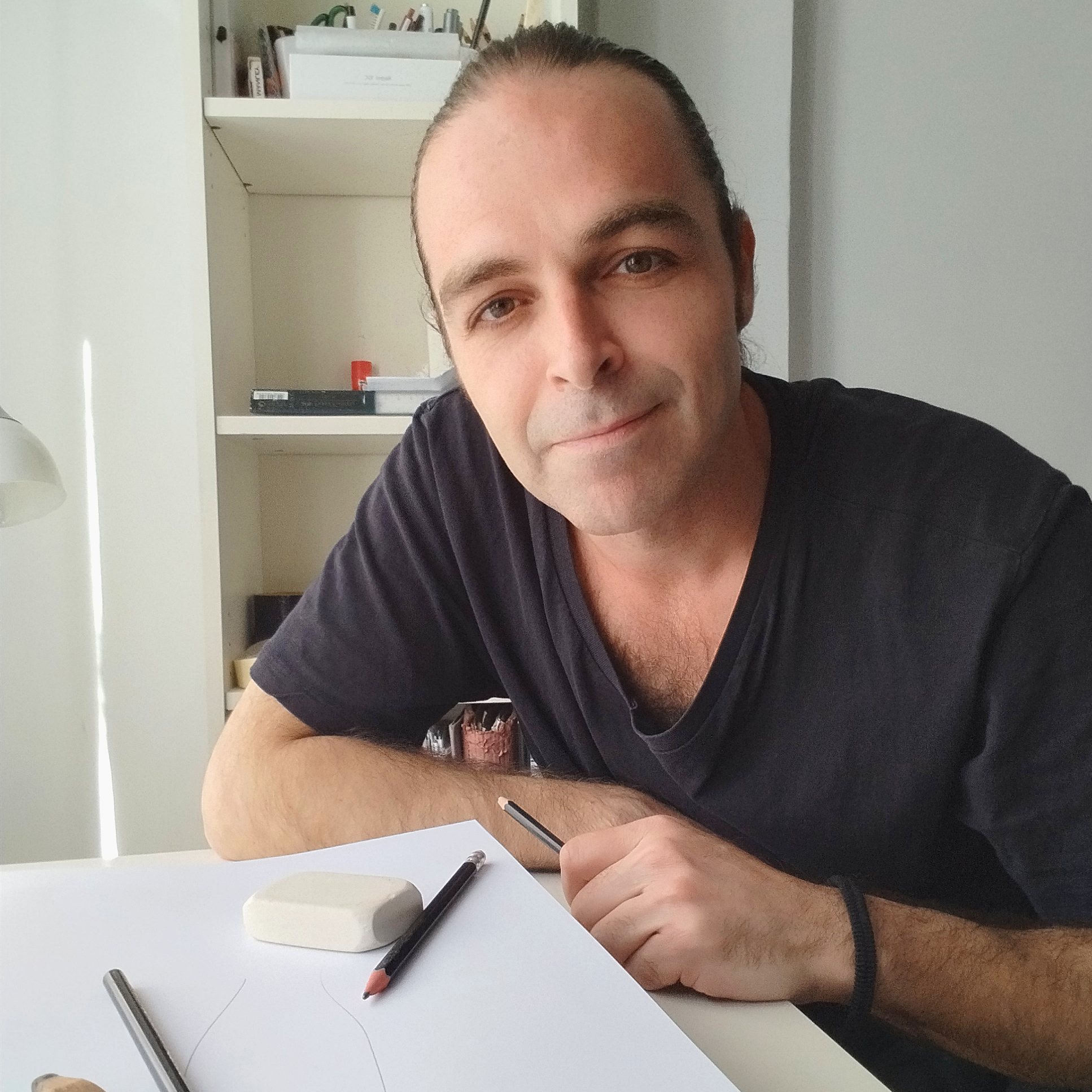
Zino, stage name of Luigi Franchi, was born in Teramo in 1973. During the 90’s he studied art history at the University of Bologna, graduating with a thesis on Francis Bacon and started attending the contemporary art world collaborating with some artists from the “ex-pastificio Cerere” in Rome.

At the end of the millennium, he contributed to the realization of some installations for international artistic events (Fuori uso, Trasalimenti) before embarking on a parallel path in the restoration of works of art, graduating in 2003 at Palazzo Spinelli in Florence.For over 15 years he has been active in the recovery and preservation of the Italian artistic heritage, specializing in the restoration of paintings and frescoes from the Renaissance to the Baroque.Since 2008 he has been teaching History of Art in high schools.In 2014 he collaborated with the Academy of Fine Arts in L’Aquila teaching the course “History of restoration”.Since 2017 he has been living and working in Rimini where he teaches, cuts, glues, writes, plays and takes part in the cultural life of the city.Zino has exhibited at various public institutions, galleries and art fairs. (Camec La Spezia, Pino Pascali Polignano a Mare Foundation, Carrara Plastic Arts Center, Liquid art Capri, Gallery 1opera Naples, Gallery B4 Bologna, Setup art fair Bologna, Galleria Zamagni art Rimini).

Involved and interested in contemporary society, from consumerism to globalization, from pop culture to youth fashions, his journey has been characterized by the use of different materials mostly belonging to non-artistic environments such as Lego bricks, PVC balls, 3D printing.It is the most recent research centred on the image distortion intended as mass-media icon in which a meaning transposition is established, allowing objects and people to accumulate new and different significance when filtered through the net or the television, essentially through an act of image “pixelation”. The images are accurately reproduced on paper but part of their surface is modified through the use of Lego bricks, in a sort of computerised enlargement, causing an interference in the object comprehension which do not prevent its correct reading, but simply marks an invisible line in balance between realisation and complete alteration. The constant search for new formal solutions to talk about today’s society and the curiosity to experiment with different languages to test their expressive potential are the basis of his work.