Posted on

Giorgio Tentolini

Giorgio Tentolini was born in Casalmaggiore (Cremona) in 1978, he trained in Graphic Arts at the Toschi Art Institute in Parma, to graduate in design and communication at the University of Reggio Emilia. After stages with artists such as Marco Nereo Rotelli, he began a very personal research with installations on a photographic basis, for which he immediately obtained significant recognition. His paintings are influenced by his work as a photographer when he used to break down images in chiaroscuro levels.

Each of his works is born from a precise investigation of Time as memory and identity, in a careful and slow reconstruction that takes place with the study of light and the engraving of layers of different materials, fabrics, papers, PVC. Tulle and adhesive tape are the current medium of his search for the meditative lightness that its layers give back to the image, a metaphor for places and memories, dreams and visions. A pictorial work living the reality of sculpture.

Through the stratification of memories and experiences, the image resurfaces in this intangible substance, made possible only by losing oneself in a vision that does not follow the cognitive parameters of perception, raising doubts and questions about the true consistency of human being and the impossibility of fully grasping the essence of reality.


Posted on

Kaja

Kaja Upelj was born in Ljubljana, Slovenia in 1992. Lives and works between London and Ljubljana .Kaja Upelj’s practice gives presence of something alive, organic, and sensual, and is challenging an individual’s interaction, and prompts a deep questioning of perception itself. Exploiting innate characteristics of materials and capturing the essence of the body; both as a form and as a medium, the works elicit physical and sensorial responses. Through the manipulation of primary materials such as glass, metal, and marble, Upelj emulates subtle nuances of bodily gestures, whose physicality she integrates into her work, though in a more abstract and less figurative sense. These sculptures possess a delicate and fragile beauty of intimacy, tenderness, and tension that define our relationship with ourselves and others. Despite being crafted from cold and sturdy materials, they evoke a sense of warmth and softness that makes one doubt their original composition. The iridescent dichroic color found in her work symbolizes the viewer’s unstable perceptions. Our perception is not a fixed construct but rather a fluid accumulation shaped by childhood experiences, daily encounters, and interactions with others.

Through her work, Upelj delves into anthropology and psychology to determine the complex tapestry of human connections. She draws intensively from her own body and imprints left of social interactions, implicit knowledge, and the environment she belongs to. Flowers accompanying her works indicate rituals evoking the transformative nature of our personal journeys, mirrors are used as a means of acceptance and reflections on self, and her sensual glass objects eloquently portray human beings so beautifully; strong in appearance, fragile in reality.

Posted on

Ryaskartstyle

RYASKARTSTYLE is an artist whose creative method was shaped by the street. Concrete fences, roofs, and factory walls were RYASKARTSTYLE’s first canvases on which he printed his protest to aggressive industrialism. RYASKARTSTYLE’s paintings are deliberately simplistic – reduced to stenciled primitivism. The street became the basic school where the artist began to create poems of ideal spaces without man, in which there is only room for “absence. RYASKARTSTYLE’s first exhibitions were on fences, the sides of garbage cans, and the hulls of broken-down cars. Then RYASKARTSTYLE bolted his canvases to concrete highway structures, where he burned them with kerosene lamps. After this ritual of purification by fire, RYASKARTSTYLE turned his energy to the space of galleries and museums. 

Despite this shift of interest from blasphemous industrialism to emaciated exhibition halls, his canvases retained the “absence”, acquired during a period of active protest against ruthless mechanization. This view of the artist has proved popular with a large number of collectors and art critics living in luxurious penthouse interiors, where for them RYASKARTSTYLE paintings became windows into a world of “absence .”

RYASKARTSTYLE celebrates not life, but rather its “absence.” Bright colors and open geometry of forms are cunning maneuvers of the artist, hiding the deep tragedy of man in civilized society under the celebration of decorativism: we create perfect sets of views, perfect sets of objects, perfect sets of shadows falling from our perfectly set objects… but we are not God –we cannot inhabit that was created by man.

Posted on

Billy Bagihole

Billy Bagilhole grew up in a household full of his father’s paintings and prints. From a young age, he drew Native Americans, animals, and religious figures, imitating those images created by his father upon the walls. They continued to be a fascination as his father passed away when he was 6 in the year 2001. His experience was embellished as a time capsule of creativity for works ongoing. He often states that the reason he continued to pursue art was because of his father and this is why his empathy for mark-making, for creating is so strong.

Bagilhole predominantly works through the mediums of painting and filmmaking.  Often covering canvases with salt and thick paint, he enjoys the technicality within painting, within color, and within the eye of the lens. Bagilhole frequently works through internal gestures and hints of nostalgic representations of abstracted life, often colliding colors with imagery of sinisterness. He feels that painting becomes an expressionistic form of understanding and that by leaving the work as an open question, an unknown metaphor, meaning within painting or filmmaking, within art becomes infinite.

The attraction to painting Bagilhole states is the ability to create the unknown, the unimaginable, and the uncanny, creating a sense of bewilderment. With sequencing themes such as the often-seen fish bones, his occurring character “Edwin” or the bull, we can start to see a hint at relations between these often differentiated pieces of imagery. Bagilhole believes that we are inherently curious and that the pursuit of art offers an expression of this curious nature. Making art becomes a medium for wonder, something unsolvable a sensory koan that engages both artist and viewer. 

Posted on

Saxon Quinn

Born in country Victoria (Aus.), Saxon spent his childhood surrounded by creativity. His mother – Dianne Coulter, also an artist, has had a large studio and gallery on the family property since he was born. His mother is definitely his mentor. He grew up with a huge studio that his mum worked from, hed always be with her. Dianne is an incredible artist, her works range from figurative and abstract sculptures to individually-dyed garments and paintings. After studying Communication Design and building his career in Melbourne, Saxon moved to New York City, immersing himself in the city and its urban patina. The beauty he found in the aged and weathered elements was cemented as the foundation of his creative work, and painting became the outlet.

Now, from his studio in New South Wales (Aus.), Saxon primarily uses canvas, graphite, and paint, layering hues, symbols, and textures to create works that sway from the intentional to the unrestrained, the minimalist to the uninhibited. Each piece bears meaningful motifs alongside elements of mischievous humor, with each mark representing an aspect of his life. These marks are arranged precisely to induce a sensory effect, where a calming constellation can be found in a world of perceived chaos. His explorations use the medium of stained and marked canvas as a literal elucidation of the experienced environment. A narrative of monolithic shapes, line work of differing rhythm, geometry, space, and markings. 

Saxon has grown to love the process of distressing on surfaces that occurs over time; pavements worn by the pedestrians footsteps, weathering elements by nature, or human error. Narratives of overall shape, lines of different rhythms, geometry, space, and marks; each individual mark ends up being an intersection of sorts, much like scarred skin on a body ——– a portal to a life experience.

Posted on

David Horgan

David is a London-based artist interested in social commentary. His works are full of metaphorical stories, as well as conveying fictional narratives gathered from life, often expressing figurative scenes in a fast-paced, raw, and emotive style, all of which are full of positive and lively sense of humor.

His creative inspirations mainly arise from the fusion of everyday experiences with popular culture and imagery. Whether it’s wallpapers, literature, poetry, a piece of clothing, people on the streets, an interesting sound, any texture or color, and, well, his wife dancing! 

David usually uses acrylic. He likes the immediacy of acrylic, which satisfies him is that he likes to paint quickly, showing the vividness of brush strokes and mixed colors. David also creates monochromatic screen prints, building in multiple layers in a spontaneous and unplanned manner.

He was influenced by so many, but in terms of modernity, Henry Taylor, Chantal Joffe, Danny Fox, Jordy Kerwick a,nd Cassi Namoda are some of the artists who had inspired him the most.

Posted on

Alejandro Monge

Born in 1988, studied Fine Arts, Sculpture and Visual Design at the Zaragoza Academy of Fine Arts. Currently focusing on sculpturing.

The portraits painted by Alejandro Monge transcend the visual depth of two-dimensional works. The volume and depth of his creations make them almost sculptural, striving to break through two-dimensional space. The chiaroscuro is reminiscent of Caravaggio; John Singer Sargent was his greatest influence.

Although Alejandro Monge specialized in sculpture during his visual arts training, the painted parts in his art are stunning in a hyperrealistic way that is reminiscent of photography and tries to trick the eyes of the observers. Afterward, he began to focus on the creation of sculptures and installations, one of which revolved around realistic banknote sculptures. Monge recreates them on paper and acrylic paint, stacking them in large piles, often in order to incinerate them. By destroying his own work, he satirizes his criticism of the omnipotent domination of today’s social and economic values, and this series has attracted extensive coverage and attention in the international media.

Alejandro Monge reflects on destruction as a new form of creation. While busts are invaded by contemporary classical elements, they still burn in the purest Baroque style or iconic objects reflecting contemporary events. With this, Monge presents an eclectic exhibition that combines different techniques and materials to generate an unusual aesthetic challenge. Each piece takes a long time to create, and he invests his body and soul, creating an emotional and psychological feedback between the artist and the piece.

Posted on

Oton

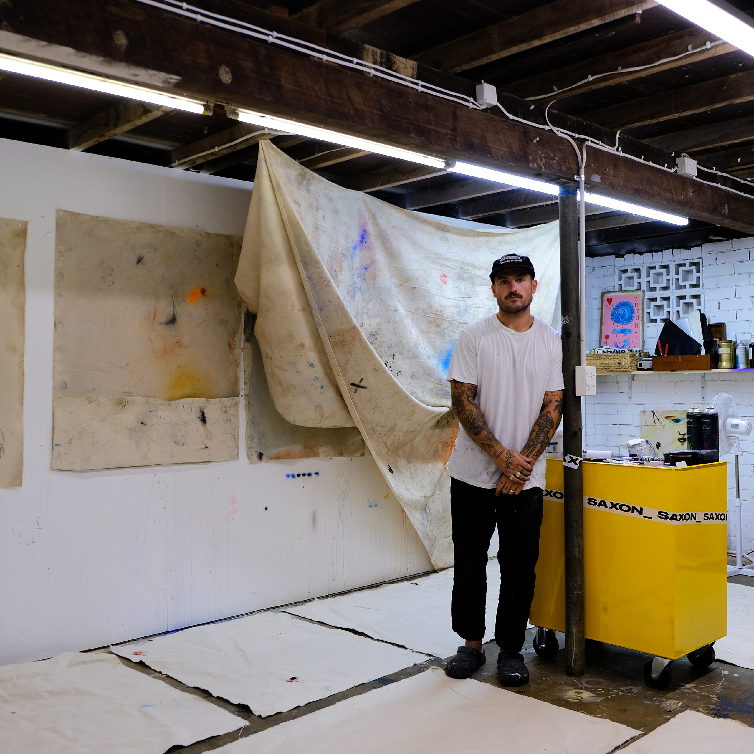
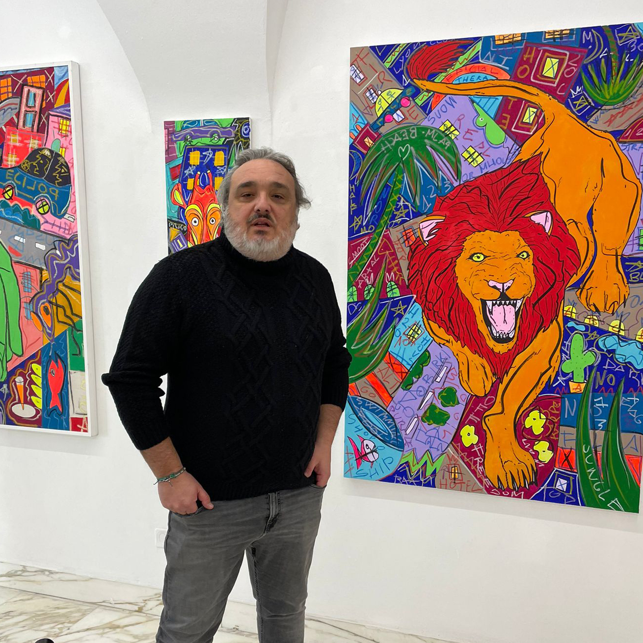
Self-taught and self-trained, Oton always has a passion for painting and drawing since childhood age, particularly keen on depicting scenes related to Madrid. Without stopping painting,  he completed high school and then completed his training specializing in graphic design. With no desire to abandon his permanent dedication to painting, from a very young age he has worked in the hostelry business, doing diverse jobs such as waiter, cook, etc. A few years later he carried out various graphic design projects as a creative in the advertising field. After many years of effort, Oton eventually can dedicate himself full-time to his painting, something that he has been fighting for all his life. 

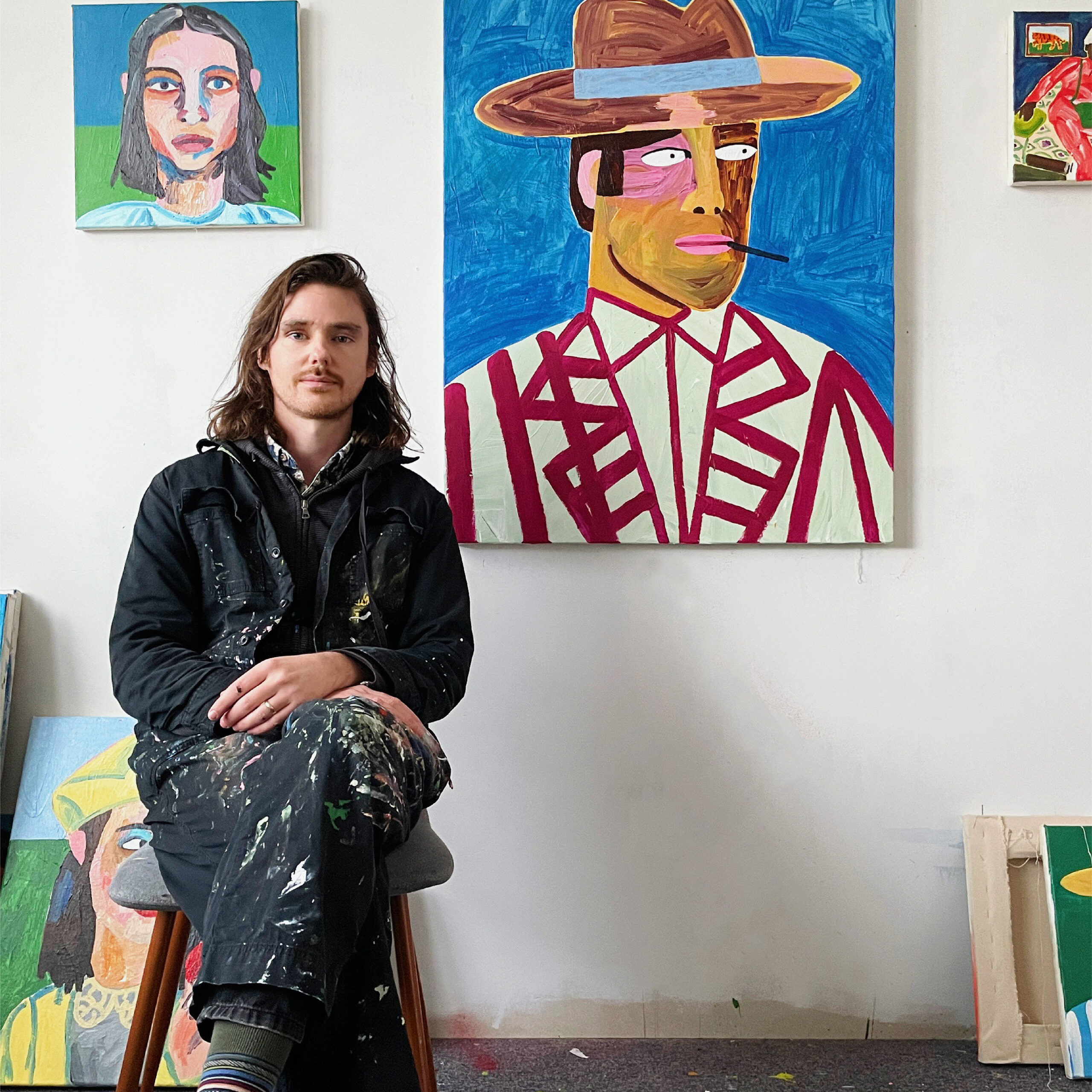
In 2005, Oton opened his first individual exhibition. He painted on board and paper, where he started with painting, then followed with a processual and iconic repertoire of collages: fragments of magazines, glued to the support, are intermingled with the painting and dialogue with certain aspects of neo-dadaism, abstract expressionism, or pop-art. This first stage of Oton’s works led him to focus more on the images.

It was when Oton made collections of collages. He created more than 600 works in small format, completely excluding painting. He wanted to create conceptual works that question us about our relationship with the images of the mass media and the world of art, something that has a language of its own, critical and ironic, where humor ends up unifying the discourse, and where the smile, often present, becomes a grimace.

After some time looking away, by chance, what Oton seeks appeared from the hands of his 2-year-old nephew. With him, Oton spent time drawing and coloring children’s notebooks. It is then, Otonobserved how he had fun crossing out, blurring, or scribbling a smile on Mickey Mouse, Goofy, etc., where he realises that there is something crucial and interesting.

This is how his process begins. A playful job. A pure and innocent drawing. Where there are no rules and everything is put at the same level. A hand, an eye, a breast, an ass or a cock, they are the same. “I just draw. I give them attributes, and in the end it almost seems that they are the ones who are drawing themselves, laughing at themselves.”

It is also a fresh and spontaneous look at the sweetened and consumerist world with Disney’s signatures. They are iconic symbols of popular culture, parodied in a vulgar and scathing way, making them ironic and mocking images that make you smile. A critical look, once again asking us about our relationship with Fanzine iconography. Oton is interested in the line, the blot, the blur, the error. As necessary as the success.

As a result, gestural impulses on paper, created by using pencils, crayons, pastels, etc., enrich a lucid and acid work that does not leave you indifferent. Antics on paper, where ingenuity and irreverence are embodied with plasticity and naturalness, in a crazy and fun work.In short, it’s a child’s game.


Posted on

Miguel Angel Funez

Miguel Angel Funez has a degree in Fine Arts and holds a Master’s degree in Art and Creative Studies with distinction from the Universidad Completeness de Madrid. From an early age, he knew that happiness was closely related to art. He has always been interested in the subject of art: everything related to artists and museums has attracted him. The excitement and shock he felt when he first visited the Prado Museum in Madrid as a child is still unforgettable. Every day, he kept drawing, trying to surpass himself.

The various iconographic appropriations and subsequent manipulations based on popular images are the starting point, showing a sample of a diverse reality while being seduced by fiction. A story that not only considers the object of the miracle, but is also subject to admiration and surprise, including instinctive repulsion and disgust. The paintings that make up this series show the contemporary “horror vacuum”, including everything that cannot exist at the time, that exists and that does not exist, that frightens us and seduces us, that belongs to us and delights us, that prompts us to imagine other worlds different from our own.


Posted on

Max Bi

Max Bi’s inspiration comes mainly from the 1980s, a time of cultural upheaval with global capitalism, mass media, wealth disparity, and unique music typified by electro-pop and hip-hop. In addition, the 1980s were filled with politically pivotal events, such as the fall of the Berlin Wall in 1989, which marked the end of the Cold War. Max Bi was more influenced by important street and graffiti artists of the time such as Jean-Michel Basquiat, Keith Haring and Kenny Scharf.

In the early 2000s, Max Bi reproduced the writer’s calligraphic graphics on raw jute canvas using stencils and spray cans, their labels, which resembled the original glyphs, and took his figurative cues from Italian Pop Art iconography . Tribal masks from the Paladino or Basquiat-style graffiti, but reinterpreted in an informal way. A lot of fluorescent colors are used in Max’s works. This kind of color matching is often accompanied by a sense of distance and surrealism. At first glance, it is the sum of bright and colorful, but if you go deeper, you will find that his humorous vocabulary, words and Alternating space-time changes.

Max Bi’s animal series depicts imaginary cityscapes inhabited entirely by animals, where the presence of humans leaves free space for the actions of animals, sharks, wolves and many other animals are the only protagonists in the narrative, carefully Look at these animals all have anthropomorphic features and stand in the foreground with irregular bright color elements superimposed. In these works, animals and humans switch roles, with the former inhabiting the latter, giving life to the scenes and making the viewer wonder whether these cities represent freedom or a cage. Max Bi’s artistic language is the result of 20 years of figurative research, in which the artist experimented with a mixture of languages ​​and various expressive techniques. The result of this constant search for novelty and variation led him to draw unambiguous inspiration from the pictorial panorama of Italian Pop Art, such as Palladino’s tribal masks or Basquiat’s graffiti.